In the realm of Blazor web applications, theming plays a pivotal role in enhancing user experience and branding. At the heart of this theming magic is the MudThemeProvider, a core component of the renowned MudBlazor suite. This free and open source UI component not only provides a default theme, but also allows developers to create and implement custom themes to match their application’s aesthetic. In this guide, we’ll take a deep dive into the functionalities of the MudThemeProvider, exploring its capabilities and how you can harness its power to enhance your Blazor applications.

- Introduction to MudThemeProvider
- Basic Usage of MudThemeProvider
- Diving Deep into Custom Themes
- Use ThemeManager to change settings on the fly
- Introducing my custom Themee
- Common Questions on Theming in MudBlazor
- How to Ensure Theme Consistency Across Components?
- Can I Use Multiple Themes in a Single Application?
- How to Handle Theme Transitions and Animations?
- Are There Performance Implications When Using Custom Themes?
- How Can I Override Default Theme Properties?
- Is There a Way to Preview My Theme Before Applying?
- Ready to Embark on a Cosmic Web Design Journey?
Introduction to MudThemeProvider
The digital landscape of web development is vast and ever-evolving, with numerous tools and libraries available to developers. Among these, Blazor stands out as a robust framework for building interactive web applications using C#. And when it comes to enhancing the visual appeal and user experience of Blazor applications, MudBlazor emerges as a front runner. As already mentioned in my post about blazor, MudBlazor is my favorite component suite for Blazor.
What is MudThemeProvider?
MudBlazor is a free and open-source UI component library tailored specifically for Blazor web applications. It offers a plethora of components, each designed to simplify and beautify the web development process. One such integral component is the MudThemeProvider.
The MudThemeProvider serves as the backbone for theming in MudBlazor. Whether you’re aiming for a minimalist design or a vibrant and dynamic look, the MudThemeProvider provides the tools and flexibility to achieve your vision. At its core, it is responsible for managing and applying themes throughout your application, ensuring consistency and a cohesive visual experience.
Setting Up MudThemeProvider
For those venturing into MudBlazor for the first time, setting up the MudThemeProvider is a straightforward process. It seamlessly integrates into the MainLayout.razor file of your Blazor application. Once added, you’re instantly equipped with a default theme, which can be easily customized or replaced as per your requirements.
But the capabilities of the MudThemeProvider don’t end at just providing a theme. It also offers the versatility to switch between light and dark modes, catering to the preferences of diverse user bases. This adaptability not only enhances user experience but also aligns with modern design trends, making your application both functional and aesthetically pleasing.
Basic Usage of MudThemeProvider
Incorporating the MudThemeProvider into your Blazor application is just the beginning. To truly harness its capabilities, it’s essential to understand its basic functionalities and how they can be employed to enhance your application’s theming.
Implementing Default Themes
The MudThemeProvider comes equipped with a default theme, designed to provide a clean and modern look right out of the box. For developers seeking a quick setup without delving into custom theming immediately, this default theme is a boon.
To implement the default theme:
- Ensure the MudThemeProvider is added to your
MainLayout.razorfile. - No additional configurations are required. Once added, the default theme is automatically applied across your application.
While the default theme is meticulously designed to cater to a wide range of applications, the MudThemeProvider’s true power lies in its adaptability. With just a few tweaks, you can switch between the light and dark modes, offering users a choice based on their preference or ambient lighting conditions.
Adapting to System Preferences
Modern operating systems offer users the flexibility to choose between light and dark UI themes. Recognizing this trend, the MudThemeProvider introduces the WatchSystemPreference() method. This method allows your Blazor application to detect and adapt to the user’s OS light/dark mode preferences automatically.
To use it, you need to pass a function that accepts a single bool parameter. That function will be called every time the users’ operation system preferences change.
As show you need to register you own function in the OnAfterRenderAsync lifecycle function for the first rendering pass.
In the function you’ll simply pass the given bool value to a member variable of your component. That variable can then be bound to MudThemeProvider’s IsDarkMode attribute.
Once set up, your application will automatically switch themes based on the user’s system settings, ensuring a seamless user experience.
With these basic functionalities in place, the MudThemeProvider lays the foundation for a visually cohesive and user-friendly Blazor application. As we delve deeper into custom theming in the subsequent sections, you’ll discover the extensive customization options that await.
Diving Deep into Custom Themes
While the default themes provided by MudThemeProvider offer a quick and efficient way to style your Blazor application, you may want to tweek the look and feel of your application a little. Custom theming allows you to tailor the look and feel of your application to align with your brand, target audience, and design vision. Let’s explore the intricacies of creating and implementing custom themes with MudThemeProvider.
Components of a Custom Theme
A custom theme in MudBlazor is not just about colors; it’s a comprehensive package that defines the visual identity of your application. Here’s what goes into a custom theme:
- Color Palettes: Define the primary, secondary, and many other colors for both dark and light modes. These palettes ensure consistency in the visual elements across your application.
- Shadow/Elevation: Determine the depth and color of shadows for various UI elements, adding depth and hierarchy to your design.
- Layout Properties: These properties play a pivotal role in defining the structure of your application. From
DefaultBorderRadiustoDrawerWidth, these settings ensure that your UI elements are proportioned and positioned perfectly. - Typography: Define a font family and all important settings for the fonts used in the application
- Z-Indices Settings: Affect the depth impression of the various MudBlazor components
Typography in MudThemeProvider
Typography is a crucial aspect of design, impacting readability, user experience, and overall aesthetics. With MudThemeProvider, you have granular control over typography settings for various text elements:
- Fonts: Define typography settings for
Default,H1toH6,Subtitle1,Subtitle2,Body1,Body2,Button,Caption, andOverline. - Custom Fonts: If you’re using a unique font, especially from sources like Google Fonts, ensure you include a link in the
index.htmlto load the font. This ensures that your chosen typography is displayed consistently across all devices and browsers.
Z-Indices Settings
Z-Indices play a crucial role in layering elements on a webpage. With MudThemeProvider, you can define custom Z-Indices for various elements, ensuring that overlays, modals, and other components stack correctly.
Implementing a Custom Theme
One of the cool things about theming in MudBlazor is, that you only need to change a few settings of all the different available settings. E.g. only setting values for the primary and secondary colors will do the trick in many cases:
Here we’ve create a new MudTheme instance and bound it to Theme attribute of the MudThemeProvider.
Please keep in mind, that we need to provide colors for light and dark mode if the application allows to switch between those.
Use ThemeManager to change settings on the fly
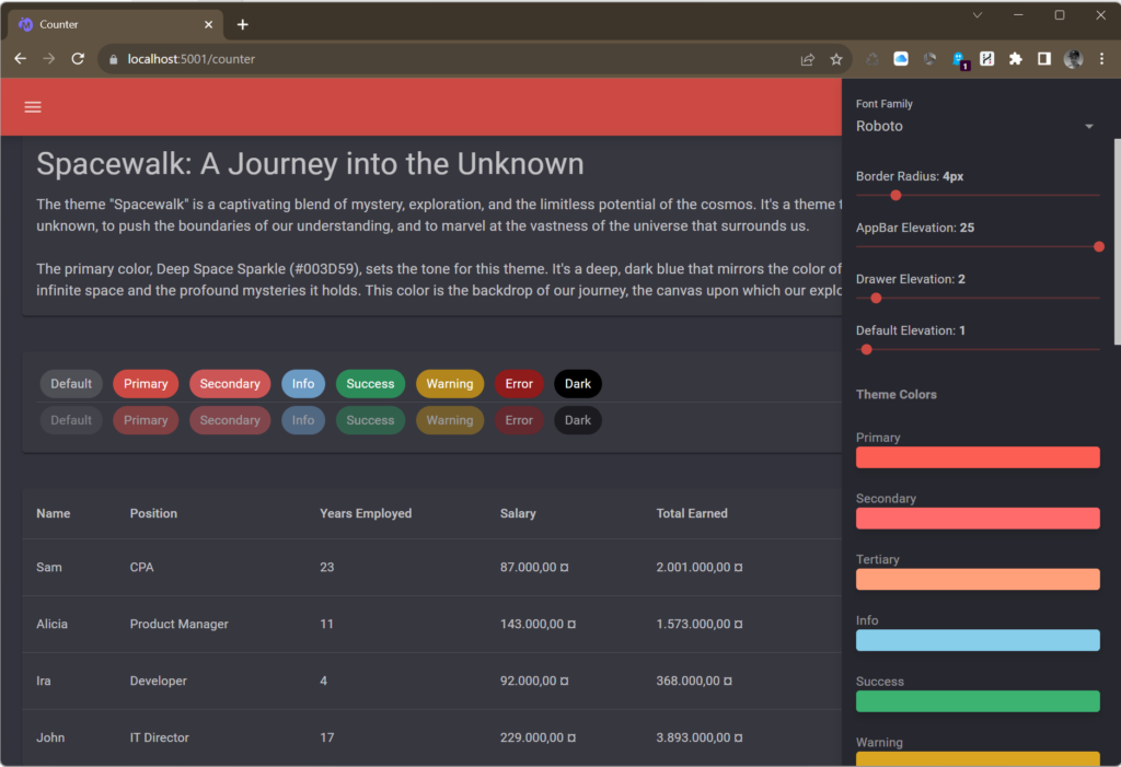
If you don’t have template from a designer it might be challenging to come up with a good color pallet and font settings. Luckily MudBlazor offers the ThemeManager for that task.
You can include the manager into you application and then you can change the settings directly inside your running program.

It really helps a lot to use this WYSIWYG approach to style your application.
Keep in mind that you have to manually include all fonts you want to try in your index.html or _Host.cshtml:
Implementation example
To include the ThemeManager, you need to install the nuget package
The ThemeManager Component needs to be added to your MainLayout.razor and a few properties of your layout must be wired up correctly. Please use this example as a reference or visit the github repo for more details:
Introducing my custom Themee
If you need a good starting point or if you like what I came up with, I’ll provide two complete custom themes here.
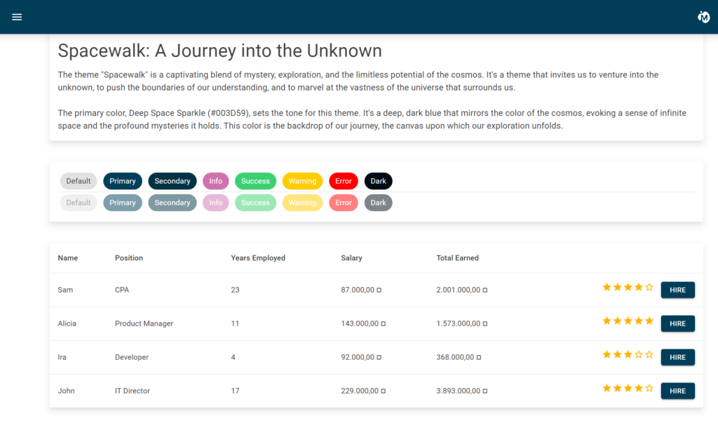
SpaceWalk Theme
This is how the theme looks like in light mode:

The class CrispyThemeSpaceWalk defines the theme:
Use it’s Theme getter to reference the theme in your MainLayout:
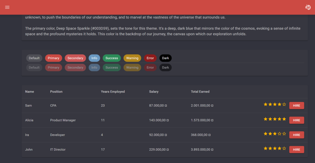
SunsetSerenade Theme
This theme does not include all possible settings but only sets all possible colors:

The screenshot shows the theme in dark mode.
This class defines the theme:
Common Questions on Theming in MudBlazor
Theming in MudBlazor, while powerful and flexible, can raise a few questions, especially for developers new to the framework or those diving into custom theming for the first time. In this section, we address some of the most frequently asked questions to provide clarity and guidance.
How to Ensure Theme Consistency Across Components?
Ensuring a consistent look across all components is crucial for a cohesive user experience. With MudBlazor, this is achieved by integrating the MudThemeProvider in the MainLayout.razor file, ensuring that the chosen theme, whether default or custom, is applied uniformly across all components.
Can I Use Multiple Themes in a Single Application?
Yes, MudBlazor allows for the integration of multiple themes. However, only one theme can be active at a time. Developers can provide users with a theme switcher, enabling them to choose their preferred theme, be it light, dark, or any custom theme like SpaceWalk.
How to Handle Theme Transitions and Animations?
MudBlazor doesn’t provide built-in transitions between theme changes. However, with some CSS and JavaScript, developers can introduce smooth transitions when switching between themes, enhancing the user experience.
Are There Performance Implications When Using Custom Themes?
Custom themes, when implemented correctly, have minimal to no impact on performance. It’s essential to ensure that any external resources, like custom fonts, are optimized and loaded efficiently. Also, avoid overloading the theme with heavy graphics or unnecessary elements.
How Can I Override Default Theme Properties?
MudBlazor’s theming system is designed for flexibility. If you wish to override specific properties of the default theme, you can do so by defining those properties in your custom theme. The custom theme’s properties will take precedence over the default settings.
Is There a Way to Preview My Theme Before Applying?
Yes, developers can utilize tools and playgrounds available in the MudBlazor documentation. These tools allow for real-time previews of themes, enabling developers to tweak and finalize their designs before integration.
Theming in MudBlazor offers a world of possibilities, and with the right knowledge, developers can craft visually stunning and user-friendly applications. Whether you’re sticking to the default themes or venturing into the realm of custom designs, MudBlazor’s theming system ensures a seamless and rewarding experience.

